模板简介
模板使用简要说明
主题配色及保存
顶部导航对应侧边栏菜单切换
侧边栏菜单的JS初始化
点击侧边栏刷新
iframe版本右侧内容区域404问题
关于非iframe版本菜单高亮
iframe版本子页面内新建TAB
iframe中操作当前Tabs
iframe页面内的loading
多标签页(Multitabs)插件说明
关于multitabs的一些调整
调整左侧的宽度
webuploader使用时候的问题
关于模板的默认主题或者配色
关于模板的字体图标问题
关于版权和商业用途
模板中固有的插件
1
光年模板的loading和消息(v3)
2
rangeSlider滑块(v3)
3
bootstrap-datepicker日期(v3)
4
bootstrap-datepicker日期(v4)
5
bootstrap-datetimepicker日期时间(v3)
6
bootstrap-datetimepicker日期时间(v4)
7
perfect-scrollbar滚动条
8
Chart.js图表
9
bootstrap-colorpicker颜色选择
10
jquery-confirm对话框
11
jquery.tagsinput标签
12
bootstrap-notify消息(v4)
13
chosen.jquery关联选择
14
jquery.bootstrap.wizard向导
15
clockpicker时间选择(v4)
16
bootstrap-maxlength长度验证(v4)
17
bootstrap-select下拉选择(v4)
18
fullcalendar日程(v4)
19
bootstrap-table表格插件
插件项目包含插件
1
Date Range Picker时间段选择
2
material风格时间选择器
3
dropzone上传
4
uploadify上传
5
webuploader上传
6
H5图片上传
7
cropper图片裁剪
8
ckeditor富文本编辑器
9
editor.md编辑器
10
summernote富文本编辑器
11
tinymce富文本编辑器
12
ueditor富文本编辑器
13
wangeditor富文本编辑器
14
bootstrap-validate表单验证
15
jquery-validate表单验证
16
bootstrap-select下拉选择
17
bootstrap-selectN联动
18
bootstrap-lyear-select下拉
19
select2下拉
20
bootstrap-multiselect下拉多选
21
lyear-dropdowntree下拉树状
22
ZTree树形菜单
23
treeview树状插件
24
jstree树状结构
25
imgVer拼图滑块
26
sliderVerification滑块验证
27
bootstrap3-dialog模态框
28
layer弹窗
29
jquery.auto.complete自动填充
30
fixedheadertable固定表头
31
fontIconPicker图标选择
32
fullcalendar日程
33
jQuery Raty评分
34
lyear.loading加载
35
Bootstrap MaxLength长度验证
36
jquery.toolbar弹出式工具栏
37
jquery.bootstrap-touchspin输入框微调
插件项目包含示例
1
表单布局示例
2
聊天页面示例
3
logo处使用文字
4
模态框中使用Tab选项卡
5
模态框最大化
6
顶部消息示例
7
搜索布局
8
搜索布局2
9
搜索布局3
10
侧滑边栏区域
11
选择示例
12
选择示例2
13
选择示例3
14
代码演示切换
15
留言列表布局
16
数据统计布局
17
产品价格布局
18
搜索框
19
用户头像篇
20
动画篇
21
其他篇
22
另一种侧边栏菜单
模态框最大化 - 光年模板说明文档 - 笔下光年
网站首页
模态框最大化
这里旨在对模态框增加最大化的功能(因为是模态框的原因,在保留模态框的一些样式基础上做最大化处理)。css和绑定事件的js可以放到通用的文件当中,模态框新增最大化按钮即可。 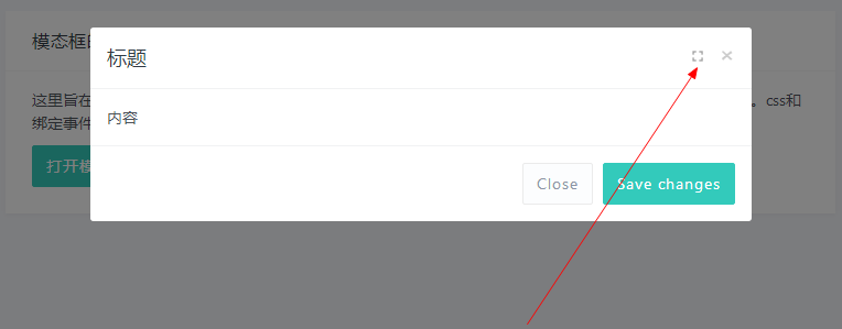 模态框原有的关闭图标后增加最大化图标按钮,3和4的版本在html上有些许区别(`modal-fullscreen-btn`)。 v3版本: ```html <div class="modal-header"> <button type="button" class="close" data-dismiss="modal" aria-label="Close"><span aria-hidden="true">×</span></button> <button type="button" class="modal-fullscreen-btn pull-right m-r-5"><i class="mdi"></i></button> <h4 class="modal-title" id="myModalLabel">标题</h4> </div> ``` v4版本: ```html <div class="modal-header"> <h6 class="modal-title" id="myModalLabel">标题</h6> <div class="float-right"> <button type="button" class="close" data-dismiss="modal" aria-label="Close"> <span aria-hidden="true">×</span> </button> <button type="button" class="modal-fullscreen-btn"><i class="mdi"></i></button> </div> </div> ``` 新增样式: ```css .modal-fullscreen-btn { border: none; background-color: transparent; text-shadow: 0 1px 0 #fff; color: #000; opacity: 0.2; font-size: 16px; line-height: 1.3; font-weight: 700; } .modal-fullscreen-btn .mdi:before { content: "\f293"; } .modal-fullscreen-btn:hover { opacity: .5; } .modal-fullscreen { padding-left: 0px!important; } .modal-fullscreen .modal-fullscreen-btn { opacity: .8; } .modal-fullscreen .modal-fullscreen-btn .mdi:before { content: "\f294"; } .modal-fullscreen .modal-dialog { width: -webkit-calc(100% - 20px); width: calc(100% - 20px); max-width: calc(100% - 20px); margin: 8px auto; } .modal-fullscreen .modal-dialog .modal-body { height: -webkit-calc(100vh - 56px - 69px - 20px); height: calc(100vh - 56px - 69px - 20px); overflow-y: auto; } ``` 新增js: ```javascript $(document).ready(function() { $(document).on('click', '.modal-fullscreen-btn', function(){ $(this).closest('.modal').toggleClass('modal-fullscreen'); }); }); ``` 因为这里做演示用,所以用了 `$(document).ready(function(){});`,如果放到 `main.min.js` 里面的时候,去掉这一层,把里面的 `click` 事件绑定放进去。 ```javascript ;jQuery( function() { // 内容放到这里 }); ``` 插件项目中页面名字:`test_modal_maximize.html` `test_modal_maximize_v4.html` [点击查看 模态框最大化 在线演示](http://example.itshubao.com/example/143.html "点击查看 模态框最大化 在线演示")
上一篇:
模态框中使用Tab选项卡
下一篇:
顶部消息示例
阅读设置
字体大小
小号 (14px)
标准 (16px)
大号 (18px)
超大 (20px)
特大 (24px)
阅读主题
默认
护眼模式
夜间模式
古卷模式
恢复默认
确定